Although the language of colour is by no means universal, it is nonetheless crucial in making an impact and communicating visually, and thus create a brand identity and draw the consumer’s attention, appealing to their emotions and awakening their senses.

Good packaging aims to connect with the consumer in under 8 seconds, the time some studies estimate the purchase decision process takes, and this will determine whether or not a product goes from the shelf into the shopping trolley. Well-aware of this, brands employ different weapons of seduction in their packaging for this very purpose, the ultimate aim being to trigger sensory springs to evoke the right sensations to stimulate a purchase. And 90% of the time, the colour of the packaging is the first thing we look at. Hence, choosing a colour is no trivial matter.
At the request of Hispack, Professor Beatriz Barco of the Master’s degree in Packaging Design at Elisava explains, from a more scientific approach, how colour is perceived and what connotations this has in order to apply it correctly to containers and packaging.
Colour is multisensory
Colour perception is fundamental in shape detection and is processed much earlier than the shapes themselves. The psychology of colours is quite complex. Colours can mean different things depending on culture, the situation and industry. But there are some sensations that seem linked to our evolutionary past and thus are universal.
As the senses are integrated, the perception of the colour of an object, such as a container, influences the characteristics of the other senses. In turn, colour conditions our memory of that object, particularly by influencing how it is categorised.
In the wine market, for example, recent studies have shown how colour influences the recognition of aromas. Specifically, a test was carried out with a group of sommeliers who, after tasting a white wine with added colouring, classified it as red, confused by the misleading colour. In another experiment, the yellow on Sprite cans was intensified by 10%, and several consumers complained of a supposedly more sour taste. They thought, because of the yellow packaging, that it contained more lemon, although the composition of the beverage was exactly the same as always.
And we could go on with other proven examples: drinks bottles and cans with cool colours such as blue or green are more thirst quenching than those with warm-coloured containers; pink packaging for confectionery products intensifies the sweet taste; and coffee is often packaged in brown packets because it enhances the taste and aroma.
In short, according to these studies, there is a direct reaction between the colour of the packaging and the taste of the food. In other words, both the detection and discrimination of a substance, as well as its perceived intensity, do not depend on smell or taste alone, but are strongly influenced (for our overall construct) by visual and auditory factors and the current reward value of that substance.

The three favourites
From a scientific perspective, there are still no serious reports that explain how we react to colours and why, at least not from a neurological point of view. We will try to approach them from psychology, physics and physiology, but also from anthropology.
Blue, green and red are traditionally identified as the three favourite colours: This could be evidence of certain implicit unconscious associations common to all humans and linked to our primate past:
- Light blue is perceived as trustworthy, calm and confident.
It is thought that this may be related to the perception, over millions of years, of the blue sky, free from danger (until we invented warplanes). - Green connotes health, freshness and serenity.
A belief that foliage and tree branches offer protection and nourishment, that is, health. It has been proven that a person recovering in hospital gets better sooner and requires fewer painkillers if their window overlooks a natural landscape (a park, leafy trees) as opposed to concrete buildings. The natural environment (and its basic associated colour, green) relaxes us and makes us feel good. - Red activates the pituitary gland, increasing the heart rate and accelerating breathing.
It is the only colour that causes a measurable physiological reaction. This visceral response makes red aggressive, energetic, provocative and attention-grabbing. Count on red to provoke a passionate response, although this is not always favourable. For example, red can represent danger.
The brightest, the most approachable, the most distant
The integral sensitivity of the eye to the colours of the spectrum slowly increases from red to yellow and then gradually decreases from yellow to violet. Thus, yellow is perceived as the brightest colour, not because of its intensity but because it triggers a greater optical response in the eye. Another colour that is quickly perceived is white. That is why it is mostly used in health-related products.
In contrast, the eye’s sensitivity to blue is much lower than these others. Hence, when it is highly saturated, it nearly seems black to us. This could also explain why cooler colours appear more distant. Warm colours, on the other hand, are generally more approachable because they better stimulate our perception. In fact, warm colours such as red or yellow have the effect of increasing the size and weight of shapes, even making objects appear to be moving towards the customer.

Connotations, according to branding
The truth is that the chromatic range is enormous and the meaning of colours varies according to the context or the product they accompany, as well as the emotions and feelings they trigger.
However, branding experts tend to agree when it comes to assigning certain connotations to the use of colours. These should be taken into account in order to get it right.
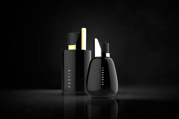
- Black: Denotes the absence of light and is culturally associated with mystery, darkness, death or evil. However, in packaging it conveys elegance, exclusivity, strength and luxury.
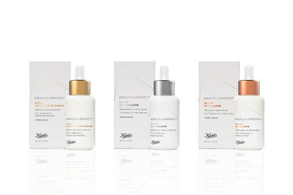
- White: Symbolises peace, simplicity and purity. It is a neutral, classic colour also linked to elegance and style.
- Blue: Sincerity, honesty, calm, trust, confidence.
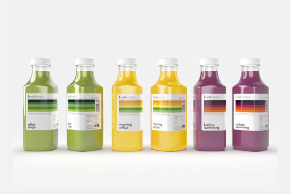
- Green: Brings serenity, freshness, tranquillity, joy. It represents health, origin and is associated with respect for the environment.
- Yellow: Liveliness, joy, happiness, optimism, freshness. Pure magnetism.
- Red: Warmth, passion, sensuality and energy. It represents the new. It is bold, exciting and contemporary.
- Violet: Uniqueness, luxury, power, modernity, confidence.
- Orange: Vitality, youth.
- Pink: Traditionally associated with femininity. It suggests delicacy, gentleness, innocence and romanticism.
Article written in collaboration with Beatriz Barco, biologist, science communicator and professor of the Master’s Degree in Packaging Design at ELISAVA.


